Choosing between dark and light cabinets is more than a style decision—it’s a choice that shapes how your space feels, functions, and even how it’s valued. Cabinetry dominates the visual and spatial experience of a kitchen or bathroom, making it one of the most impactful design decisions you’ll make. So, how do you choose the right tone for your layout, lifestyle, and long-term goals?
Dark cabinets introduce visual depth and luxury, ideal for large, modern, or open-plan spaces. Light cabinets enhance natural brightness and perceived space, making them a top choice for smaller layouts or homes with limited daylight. The optimal cabinet color depends on four key factors: room size, lighting conditions, interior style, and long-term maintenance expectations.
Let’s break down these differences and help you make a decision that fits both your design vision and your daily needs.
Style & Mood: What Cabinet Color Communicates About Your Space
Cabinet color is a design element with high visual dominance—it doesn’t just fill a space, it sets its tone. In the interior design field, this is referred to as “visual weight and emotional tone”. The psychological and spatial response to color is well-documented in color theory and behavioral design.
🖤 Dark Cabinets: Depth, Definition, and Design Impact
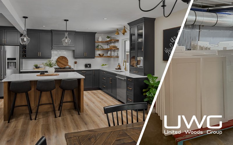
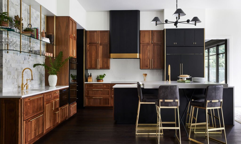
Dark cabinet finishes (such as espresso, charcoal, or matte black) convey a sense of grounding and permanence. Their visual “weight” pulls the eye downwards, anchoring the room. In design language, this creates a low center of gravity, which is often desirable in open-plan layouts.
Key characteristics:
- Psychological tone: Stability, sophistication, and intimacy
- Design impact: Enhances contrast and defines architectural elements
- Best fit for:
- Open kitchens that need zoning by color
- Designs relying on material texture like matte, grainy wood, or brushed metals
- Styles like Modern European, Japandi, Industrial, and Transitional
⚠️ Overuse of dark cabinetry in enclosed spaces can create visual compression. To counterbalance, designers often use:
- High-Reflectance countertops (e.g., white quartz, marble-look surfaces)
- Uplighting or under-cabinet LEDs to open up shadow lines
- Metallic accents (brass, chrome) to introduce reflective contrast
🤍 Light Cabinets: Visual Expansion and Timeless Flexibility
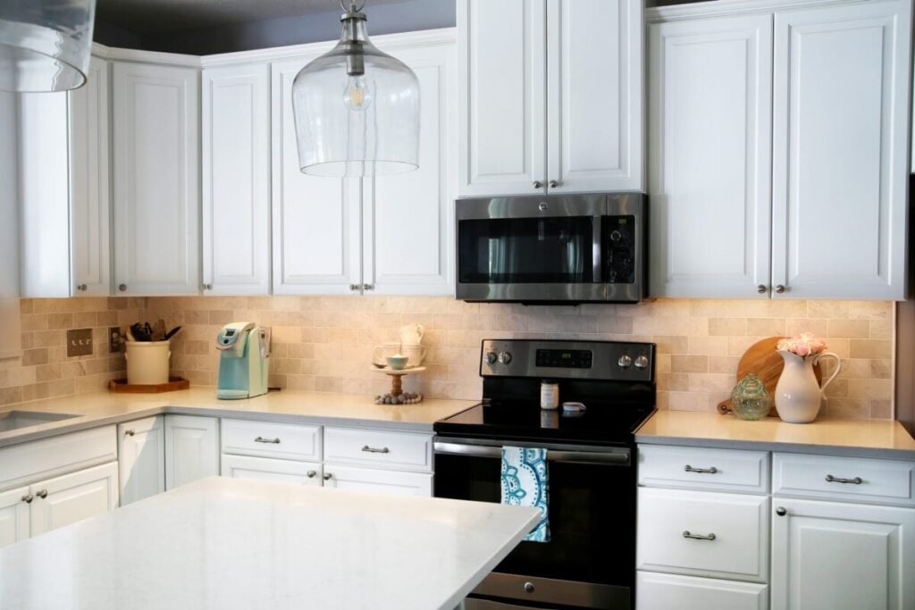
Light-colored cabinets (white, dove gray, soft beige, pale oak) offer the highest Light Reflectance Value (LRV) among cabinet finishes. In design terms, this translates to increased spatial perception—they amplify available light, making interiors feel larger, cleaner, and more breathable.
Key characteristics:
- Psychological tone: Simplicity, order, and serenity
- Design impact: Visually recedes, allowing other materials (backsplash, flooring) to pop
- Best fit for:
- Compact layouts, narrow galley kitchens, or U-shaped configurations
- Regions with limited natural daylight (e.g., north-facing homes, urban apartments)
- Styles like Scandinavian, Coastal, Farmhouse, and Traditional
📐 From a resale perspective, white and off-white cabinetry remains the most broadly appealing finish across U.S. housing markets due to its neutrality and adaptability across design eras.
🧠 Design Insight: Professional designers often use vertical tone balance—placing darker tones below eye level and lighter tones above—to create a feeling of visual lift. This is especially effective in kitchens with 8-foot ceilings or transitional layouts.
Room Size & Lighting Conditions: The Architectural Context
Cabinet color should not be considered in isolation—it must respond to the physical envelope of the space: its size, height, window placement, artificial lighting plan, and even ceiling finish.
🌤️ Small or Low-Light Rooms: Use Color to Maximize Luminance
In constrained environments, surface color contributes directly to perceived spaciousness. According to design lighting standards, high-LRV materials can increase reflected light by up to 35–50%, reducing the need for excessive artificial lighting.
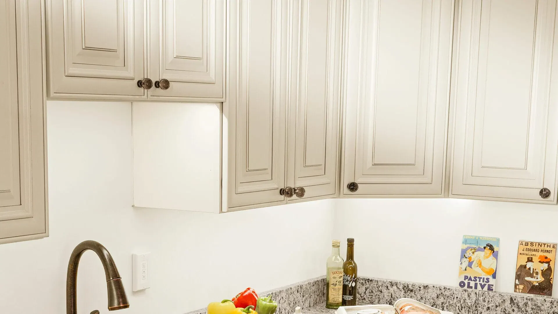
✅ Light cabinet finishes (especially satin or semi-gloss) support:
- Visual elongation of wall planes, especially in narrow layouts
- Increased bounce light from under-cabinet lighting or pendants
- Enhanced contrast with dark floors or mid-tone backsplashes
Common combinations:
- White shaker cabinets + oak flooring + soft gray walls
- Pale greige flat-panel cabinets + quartz counters + LED strip lighting
🌑 Large or Well-Lit Rooms: Control Visual Volume and Contrast
In expansive or daylight-rich interiors, visual compression is often desired to prevent a space from feeling cold or cavernous. Dark cabinetry contributes to this by reducing reflectivity, increasing contrast, and providing visual weight.
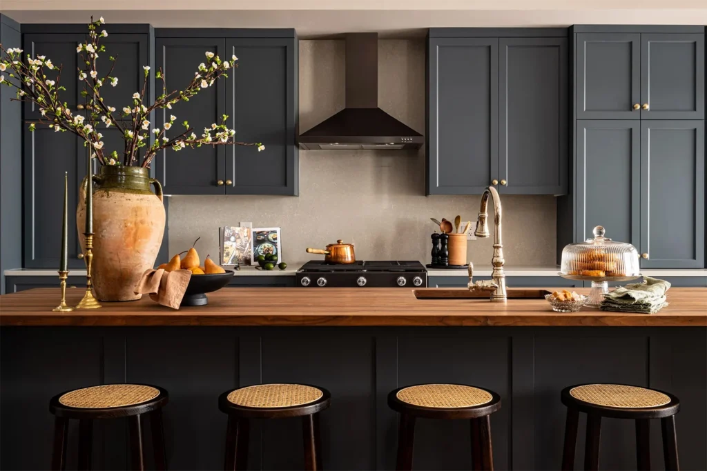
✅ Dark finishes excel in:
- Kitchens with multiple light sources (windows + recessed lights + task lights)
- Layouts that include an island or butler’s pantry to balance materials
- Homes with 9’+ ceilings, where vertical scale requires grounding elements
Typical applications:
- Deep charcoal island with lighter perimeter cabinets
- Espresso lower cabinets paired with white uppers and brass hardware
- Full dark cabinetry offset by high-gloss backsplash or open shelving
💡 Pro Tip: When designing with dark cabinetry, integrate a three-layer lighting strategy—ambient, task, and accent lighting—to prevent shadows and keep surfaces inviting.
📊 Industry Reference: LRV (Light Reflectance Value)
| Finish Color | Approx. LRV | Recommended Use |
|---|---|---|
| Bright White | 80–95 | Small kitchens, low ceilings |
| Light Gray / Cream | 65–80 | Universal, resale-friendly |
| Medium Wood / Taupe | 35–60 | Balanced warmth & neutrality |
| Espresso / Black | 5–20 | High-contrast, luxury builds |
🏠 Builder Note: In production housing, pairing light cabinetry with darker LVT flooring remains the most common and cost-efficient value engineering strategy due to its universal buyer appeal.
Material & Color Pairings That Work (and Why They Do)
Cabinet finishes rarely exist in isolation—they sit alongside floors, counters, walls, backsplashes, and hardware. From a design system standpoint, the success of any color choice lies in material interaction, light response, and texture contrast.
🔳 Dark Cabinets: What They Demand from the Surrounding Palette
Because dark cabinets carry high visual density and low light reflectance, they function best when offset by contrast or texture.
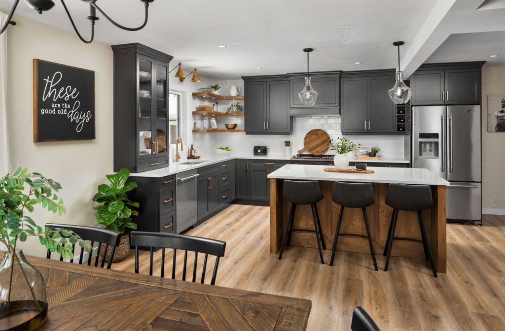
Recommended Pairings:
- High-LRV countertops: white quartz, light veined marble, concrete-look surfaces ⤷ Counterbalance cabinet absorption with reflective surfaces
- Soft neutral walls: warm greige, off-white, light taupe ⤷ Avoid stark white unless high-end minimalist is the goal
- Light wood or limestone floors: keep the space grounded yet open
- Brass, matte black, or brushed nickel hardware ⤷ Metallics act as reflectors and detail amplifiers
Design Principle: In kitchens using dark cabinetry, layering texture is crucial. For example:
Matte black cabinets + fluted glass upper doors + honed marble countertops = tactile depth without visual chaos.
🟨 Light Cabinets: How to Avoid a Washed-Out Scheme
Light cabinets—especially in white or soft gray tones—are forgiving but can appear sterile without value contrast and material diversity.
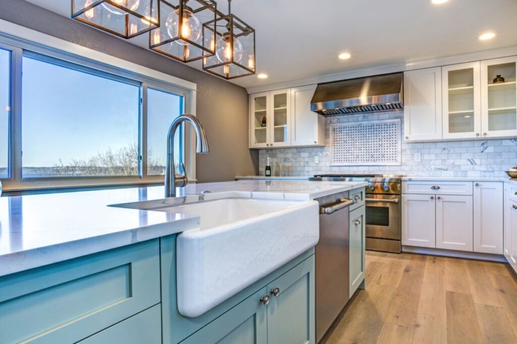
Recommended Pairings:
- Bold countertops: charcoal, navy, butcher block, terrazzo ⤷ Add character through surface pattern or tone weight
- Natural oak or walnut floors: balance warmth into a cool cabinet scheme
- Detailed backsplashes: zellige, herringbone marble, ceramic relief ⤷ Texture restores personality and avoids flatness
- Black, gunmetal, or brushed stainless pulls ⤷ High contrast outlines cabinetry shape and breaks visual monotony
Color Theory Insight: Professional designers often follow the 60-30-10 rule:
- 60% dominant (cabinetry & walls)
- 30% secondary (floor, counter)
- 10% accent (fixtures, textiles, décor)
This framework ensures tonal harmony while allowing expression through accessories.
🎯 Industry Practice: Combine LRV and Finish Gloss for Spatial Strategy
| Element | Ideal LRV | Recommended Finish | Notes |
|---|---|---|---|
| Cabinet Faces | 15–90 | Matte to Satin | Avoid gloss unless intentional for modern |
| Countertops | 40–80 | Polished or honed | Higher sheen = more reflection |
| Backsplashes | 50–70 | Glazed ceramic | Acts as light reflector & style driver |
| Flooring | 30–50 | Natural or matte | Texture contrast helps avoid visual fatigue |
Maintenance & Practicality in Real Homes (Not Just Showrooms)
Material selection isn’t only about beauty—usability, cleanability, and durability are crucial in real-world settings, especially kitchens that are actively used.
Modern cabinet finishes span from painted MDF and thermofoil to UV-coated veneer and laminate. Their cleaning response, durability, and resilience to aging vary by tone and surface treatment.
🖤 Dark Cabinets: Performance Characteristics
✅ Hide stains, wear, and edge shadowing better than white ✅ Less prone to discoloration or yellowing over time ❌ Show dust, lint, and fingerprints, especially in matte black or satin navy ❌ Can highlight grease streaks near cooktops or handles ❌ Hairline scratches are more visible on flat, dark surfaces
Best Practices:
- Choose low-sheen laminate or UV-coated veneer for resistance
- Install soft-close hardware to minimize slamming and chipping
- Use darker cabinets for base units, islands, or secondary storage (e.g., pantry)
🧰 Builder Insight: Matte black finishes should not be used directly under vent hoods unless paired with a powerful exhaust system.
🤍 Light Cabinets: Performance Characteristics
✅ Reflect more light = easier to spot dirt & smudges ✅ Easier to repaint, resurface, or touch-up minor damage ✅ Less heat absorption = more stable near ovens or sunlight ❌ Can yellow over time, especially near heat sources or in unventilated kitchens ❌ Stains and wear are more visible on flat white surfaces ❌ May require more frequent wipe-downs in busy family homes
Best Practices:
- Use semi-gloss or satin paint to allow regular cleaning without residue
- Avoid placing pure white cabinetry next to aged wood (tone mismatch)
- Prioritize light cabinets in upper cabinetry or wall-to-ceiling designs to maintain vertical brightness
🧠 Maintenance Matrix: Summary Table
| Cabinet Tone | Cleans Easily | Shows Dust | Yellowing Risk | Fingerprint Sensitivity | Scratch Visibility |
|---|---|---|---|---|---|
| White (Gloss) | ⭐⭐⭐⭐ | ⭐ | ⭐⭐⭐⭐ | ⭐ | ⭐⭐ |
| White (Matte) | ⭐⭐⭐ | ⭐⭐ | ⭐⭐⭐ | ⭐⭐ | ⭐⭐⭐ |
| Dark (Gloss) | ⭐⭐ | ⭐⭐⭐⭐ | ⭐ | ⭐⭐⭐⭐ | ⭐⭐ |
| Dark (Matte) | ⭐ | ⭐⭐⭐⭐ | ⭐ | ⭐⭐⭐⭐ | ⭐⭐⭐⭐ |
👪 Practical Advice: For family kitchens or pet owners, opt for satin-finish thermofoil or melamine cabinets—they’re easy to clean and less prone to both fingerprints and yellowing.
Trends, Longevity & Resale Value: What Matters in the Real Estate Market
Cabinet finishes are not just a matter of personal taste—they contribute significantly to perceived property value, buyer appeal, and design longevity. As one of the most visually dominant elements in the kitchen or bathroom, your cabinetry color directly influences both aesthetic lifespan and market positioning.
🔥 Current Design Trends (2020s–2025 Outlook)
- Two-Tone Kitchens remain dominant ⤷ Combining light upper cabinets with darker lowers allows both contrast and balance without overwhelming a space.
- Dark Natural Wood Tones (Walnut, Espresso, Smoked Oak) ⤷ A return to richness and authenticity—popular in custom, high-end, or mid-century-inspired homes
- Color-Infused Cabinetry (Sage, Deep Blue, Dusty Plum) ⤷ Often used as feature islands or accent zones, these shades signal personalization and departure from generic spec homes
🧠 Industry Note: 2023 NKBA (National Kitchen & Bath Association) reports show a 35% increase in requests for walnut finishes among designers serving mid- to high-end clientele.
🏡 Longevity and Resale Value: Strategic Color Planning
While color trends cycle every 5–7 years, cabinetry replacement occurs every 15–20 years in most homes. That makes long-term adaptability critical—especially for investment or resale-focused renovations.
✅ White, Off-White, and Light Gray Cabinets
- Universally appealing across markets and buyer age groups
- Offer high perceived cleanliness and spatial openness
- Photograph well in listing images (key for digital real estate)
✅ Mid-Tone Woods (Maple, Oak, Alder)
- Making a comeback as buyers shift from ultra-modern to transitional comfort
- Better at hiding fingerprints and wear than stark white
⚠️ Dark Cabinets
- Increasingly popular in luxury new builds and design-driven remodels, but…
- May limit appeal in entry-level housing markets or smaller condos
- Require thoughtful lighting and material balance to avoid looking dated
💼 Resale Recommendation: If you’re renovating for broad-market appeal, lean toward light to mid-tone cabinetry with warm undertones. These palettes complement both traditional and contemporary styling and are more likely to survive trend shifts over time.
Summary
Cabinet color isn’t a simple aesthetic decision—it’s a convergence of spatial design, lifestyle needs, visual psychology, and investment planning.
Dark cabinets deliver drama and grounding—ideal for open floorplans, larger kitchens, or clients seeking a moody, high-contrast design. Light cabinets offer brightness, timelessness, and universal adaptability—especially in smaller, family-centered spaces or resale-driven projects.
By aligning your choice with lighting conditions, material interactions, usage habits, and market goals, you’ll land on a cabinetry color scheme that not only looks beautiful today—but still feels relevant a decade from now.

